I love a good make-over. Especially those that are inspiring and are attainable. The March 2011 issue of Real Simple had two makeovers that I thought were executed brilliantly:
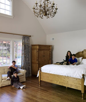
This bedroom (above) had strong pieces, and a gorgeous room to sit in - but it just needed oomph to make the beauty of the room pop!
Painting the walls and furniture really did wonders here. It makes the entire room, also the area rug and bench at the foot of the bed make it not feel so large. This room came out beautiful!
This next living room needs a big dose of cheer up! It's got such great light, and has the potential to be fantastic.
And of course - the designers over at Real Simple did not disappoint.
Focusing on the symmetry of the window wall made such a gorgeous focal point. I love the pops of color, the layering of the carpets, and the whole feel.


I just love makeovers like these. Such a huge difference in these two rooms.
ReplyDelete