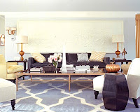
There is a lot going on in this room that makes this room work so well. The sense of neutral is fantastic, with the patterned carpet. I love the matching lamps on either side - it gives balance and symmetry.
 This room is groovy - I like the curvy sofa, its rare and original. It's also smart that they did multiple small tables in replacement of one large coffee table. The color way is also pretty fantastic.
 The above room is Kelly Wearstler- and its my favorite from this entire entry. I'm a big fan of the gold accents (which is very a la Kelly). I also like the scale of this entire room. The chandelier is also pretty bad ass.

This dining room is Shabby-Chic meets Hollywood Regency meets Glam. I dig it. It's as though this dining table needed 8 chairs (and 2 head chairs) and the designer found her favorite 8 chairs and harmoniously worked them together. Bravo!

I love the use of black paint here with the white border to give the illusion of the headboard.

Love the white walls as a backdrop for the bright green headboard and the symmetry with the night stands and lamps. I also love love love the shape of the headboard. Original. I like it.
 This room is groovy - I like the curvy sofa, its rare and original. It's also smart that they did multiple small tables in replacement of one large coffee table. The color way is also pretty fantastic.
 The above room is Kelly Wearstler- and its my favorite from this entire entry. I'm a big fan of the gold accents (which is very a la Kelly). I also like the scale of this entire room. The chandelier is also pretty bad ass.
This dining room is Shabby-Chic meets Hollywood Regency meets Glam. I dig it. It's as though this dining table needed 8 chairs (and 2 head chairs) and the designer found her favorite 8 chairs and harmoniously worked them together. Bravo!

I love the use of black paint here with the white border to give the illusion of the headboard.

Love the white walls as a backdrop for the bright green headboard and the symmetry with the night stands and lamps. I also love love love the shape of the headboard. Original. I like it.


0 comments:
Post a Comment
So... Tell me... What do you think?